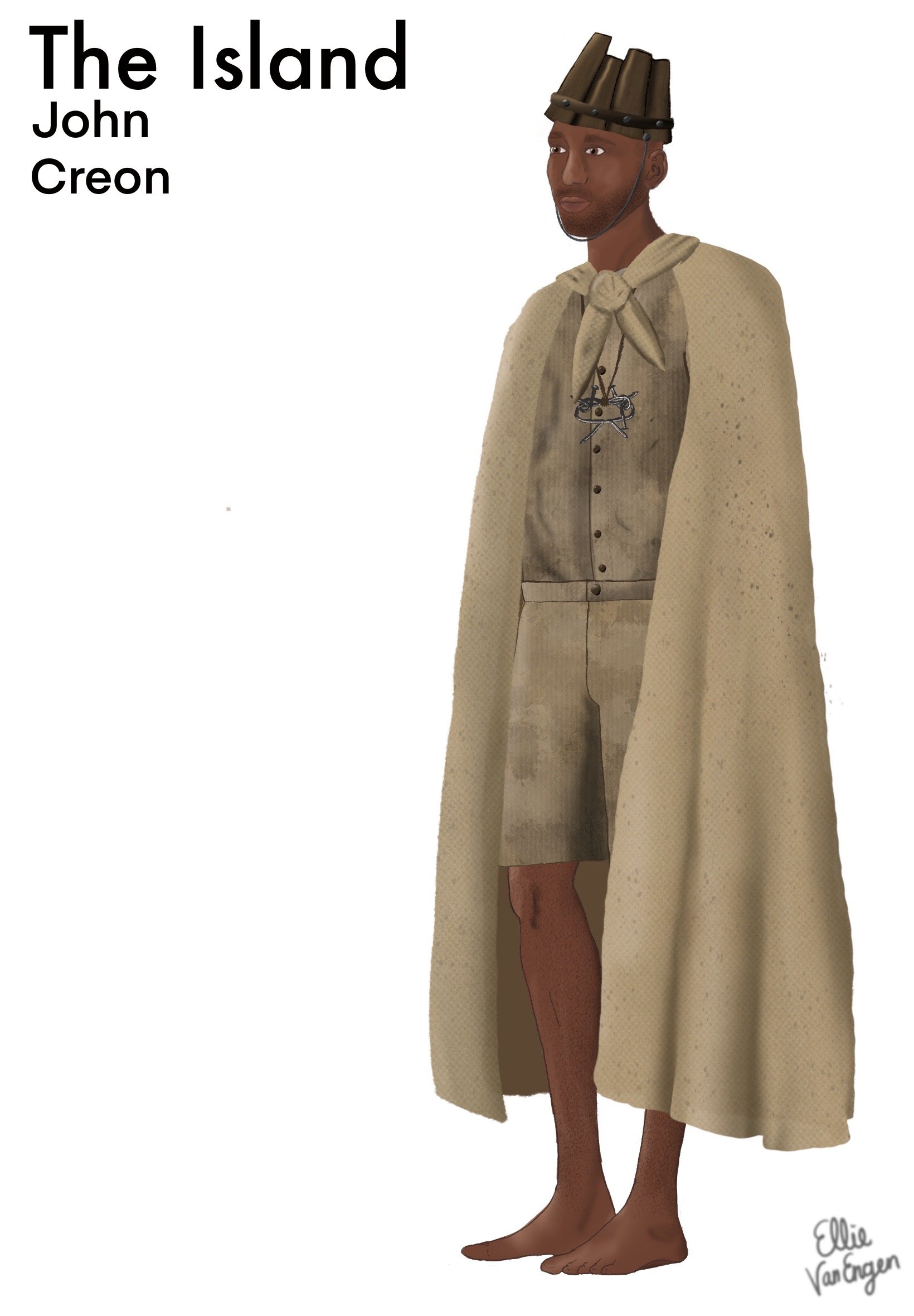
The Island
by: Athol Fugard, John Kani, and Winston Ntshona
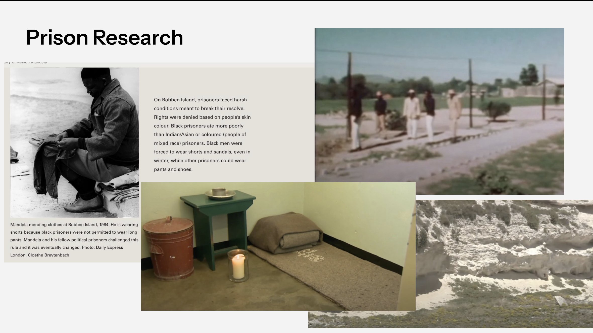
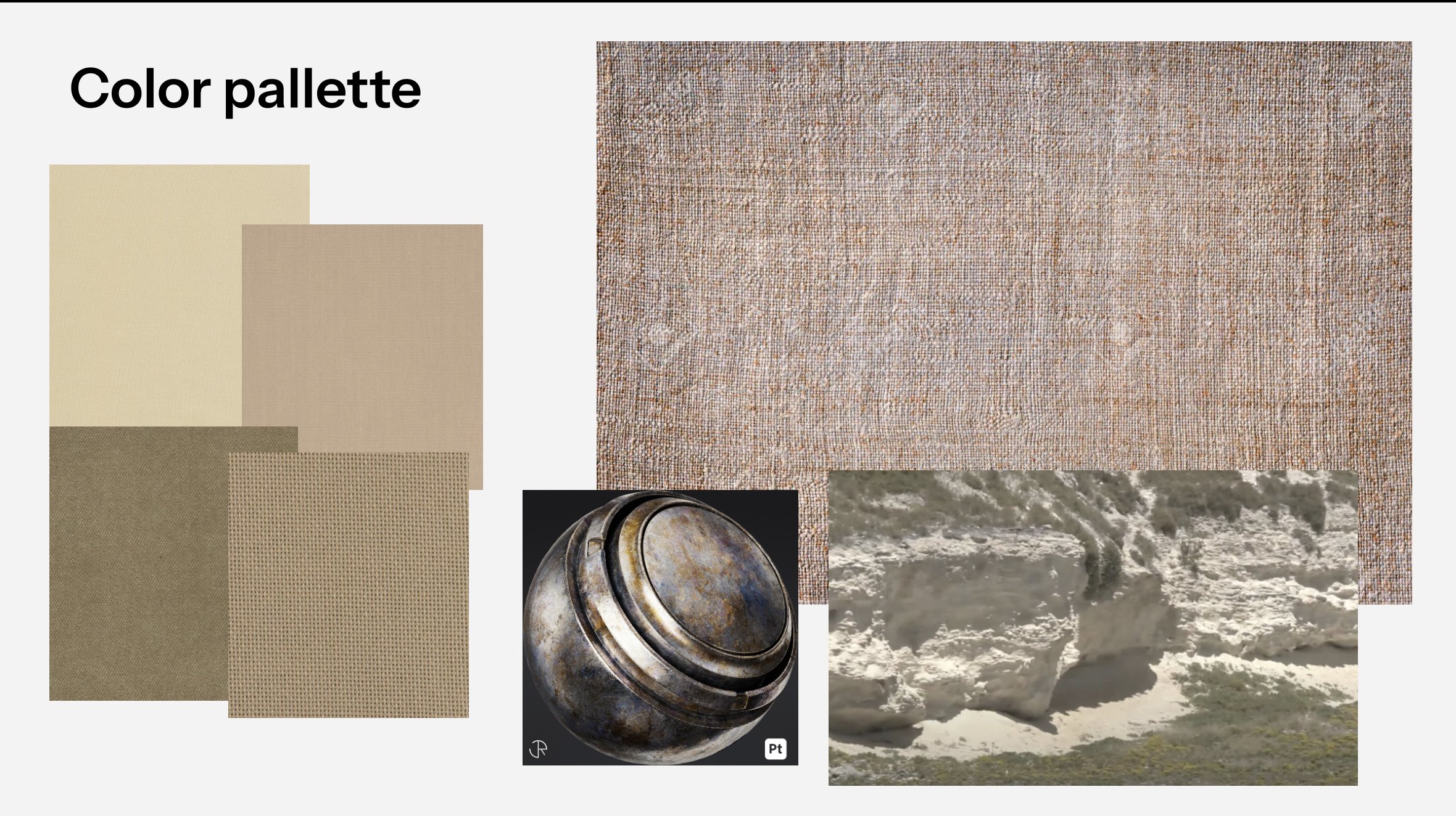
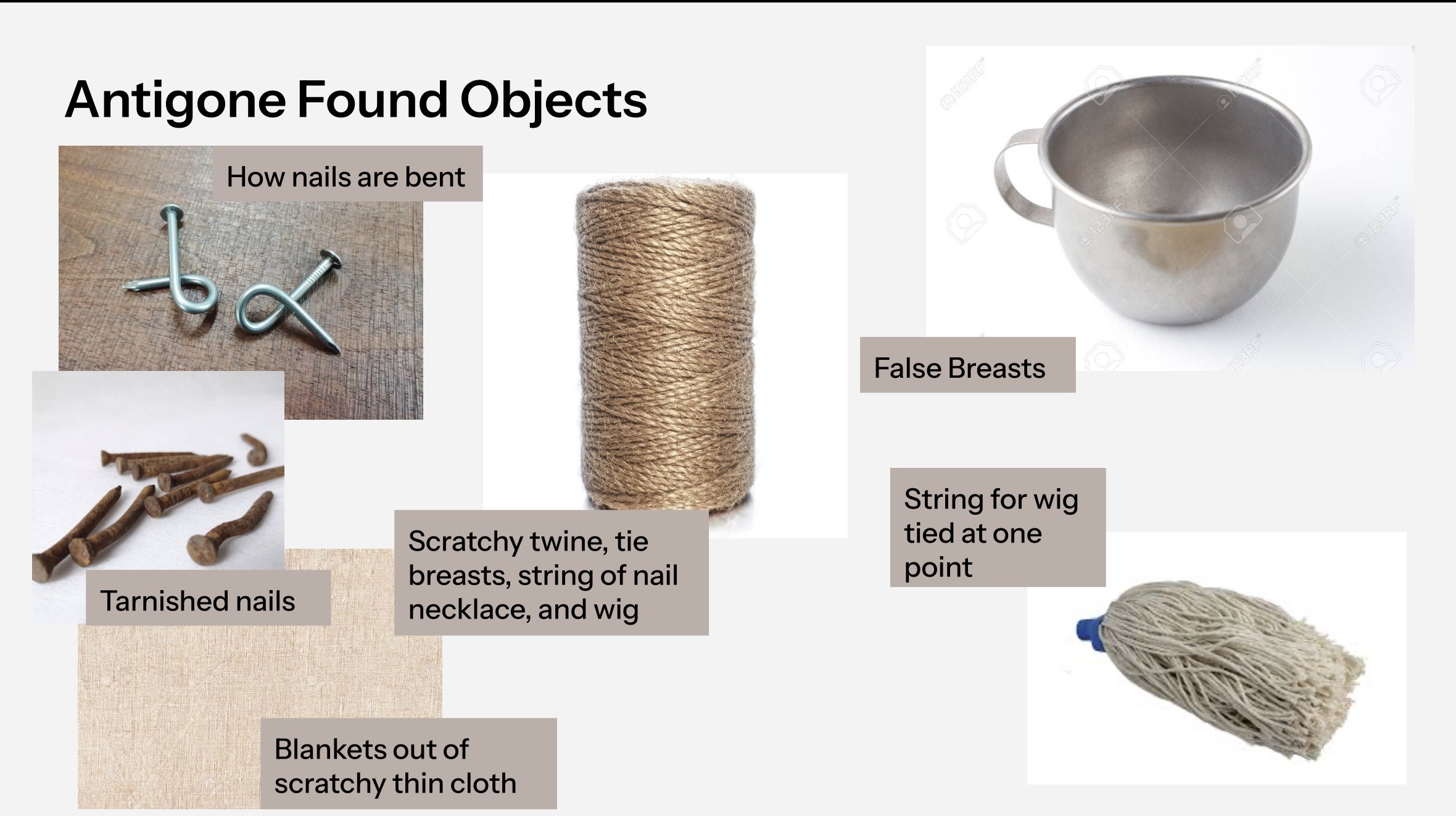
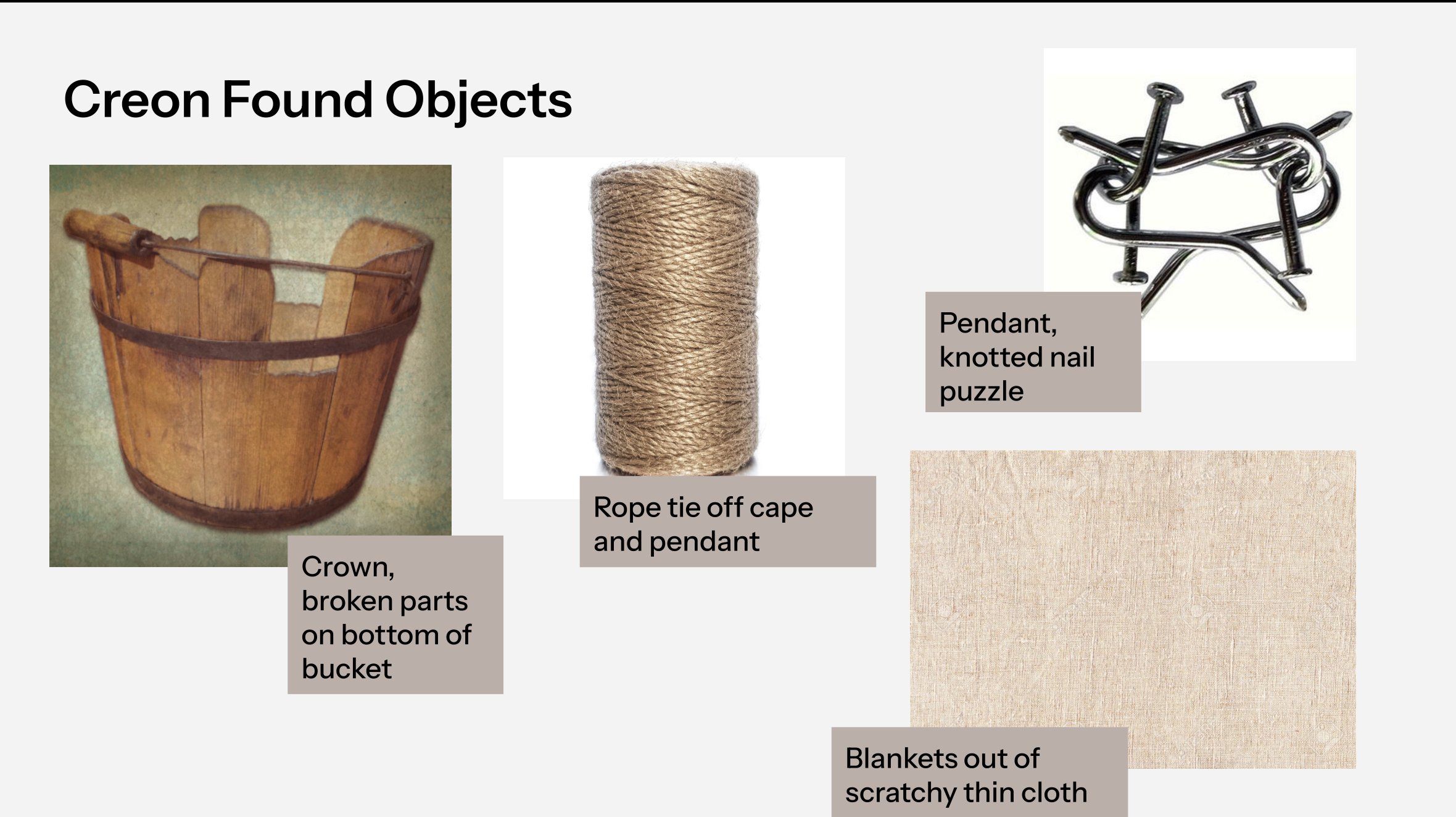
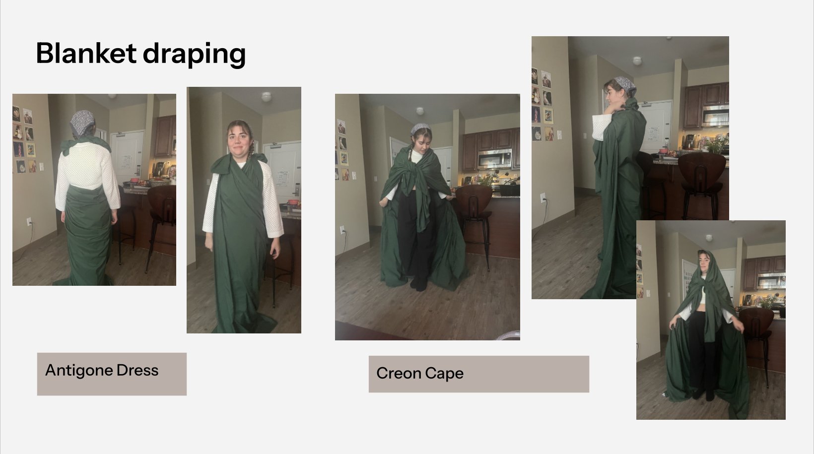
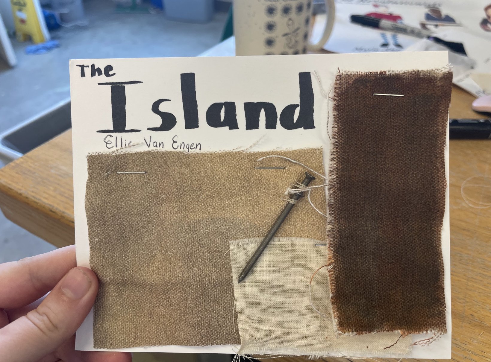
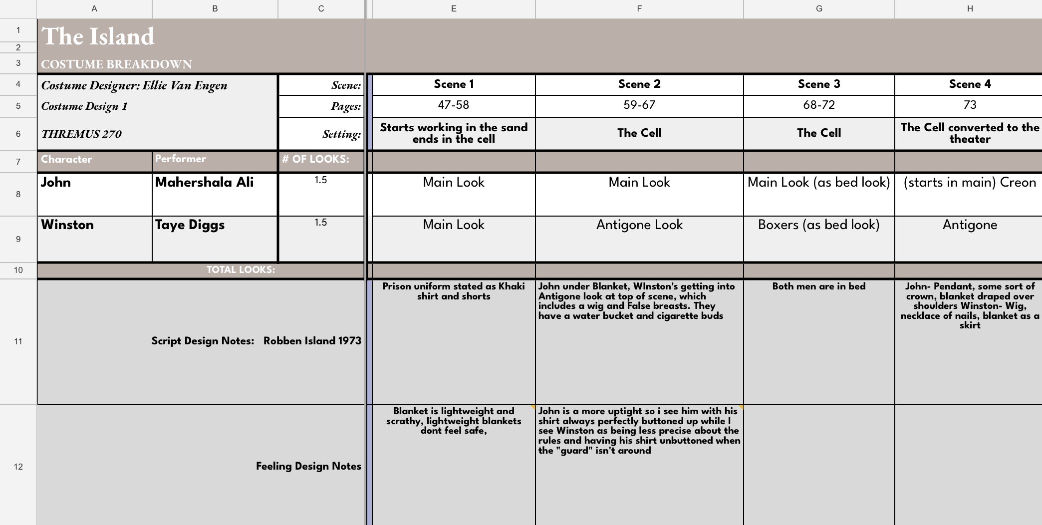
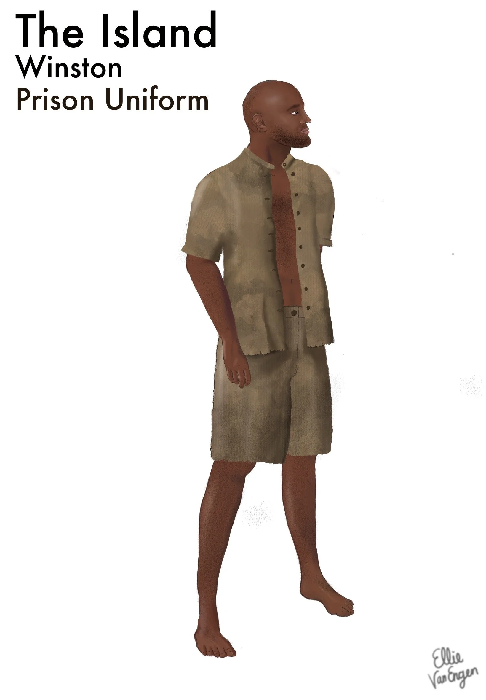
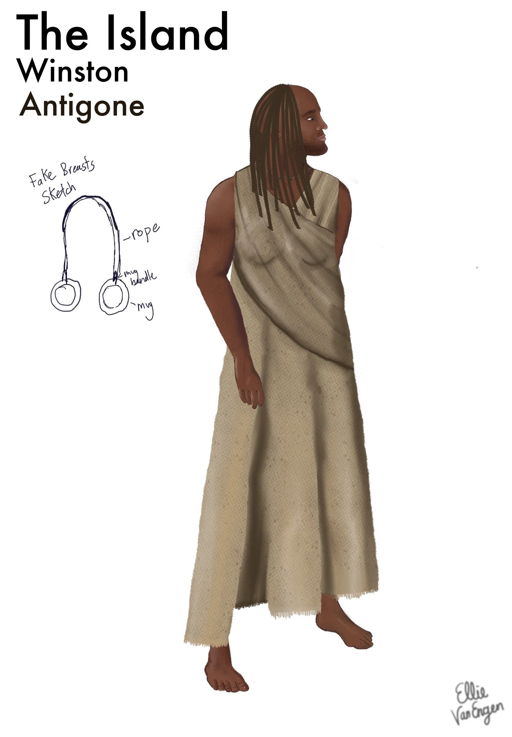
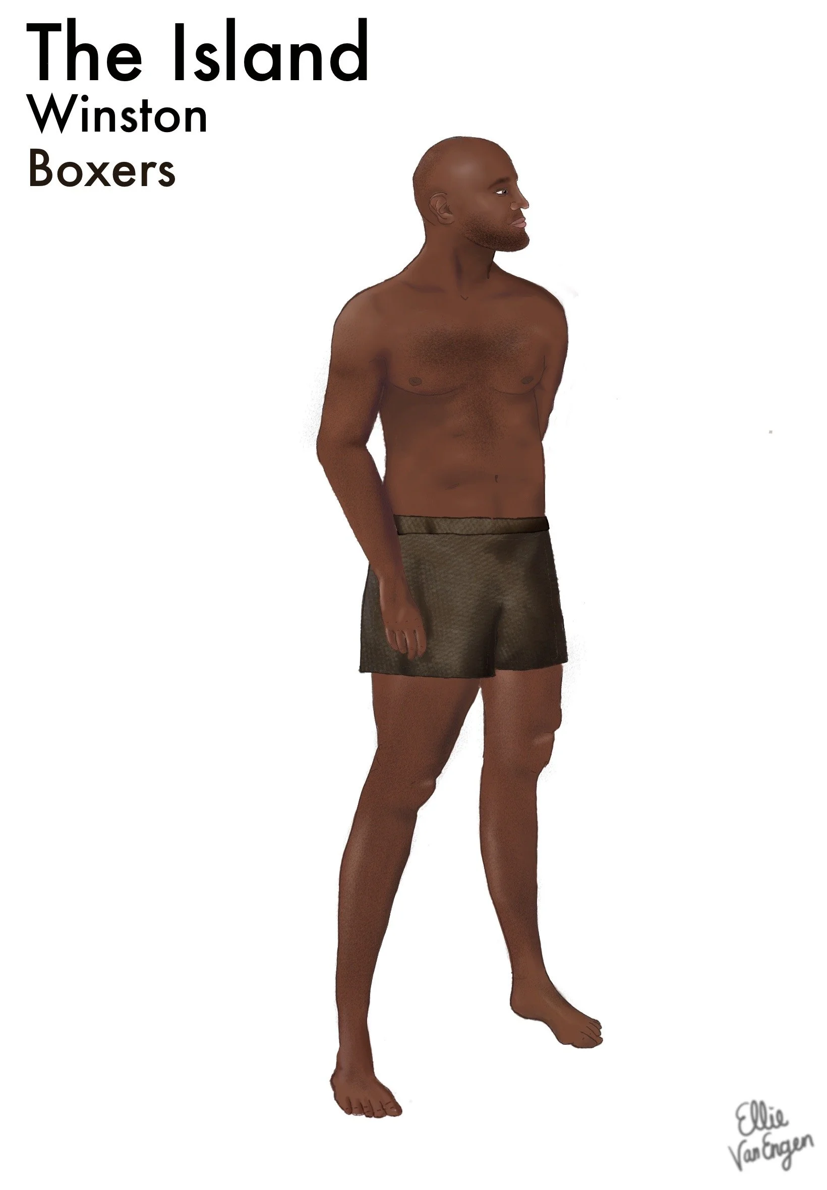
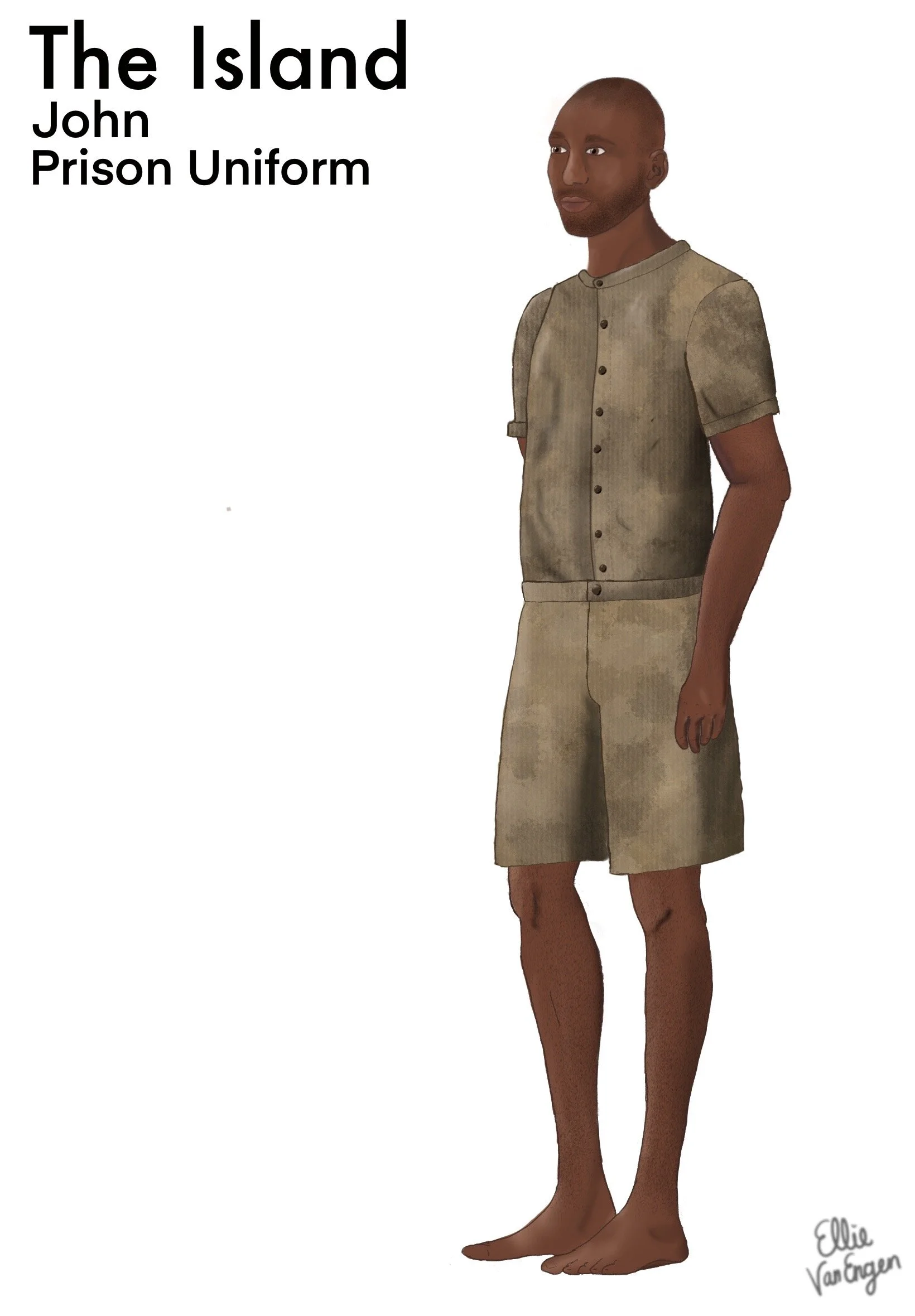
Design Pitch: After reading The Island and reflecting about the feelings it gave me, the word that became my touchstone throughout the design process was unsecure. I channeled this into the blankets which I saw as being a light fabric but in weight and color, because to me a thick blanket feels like safety. A light one makes you feel unprotected and lets in a cold draft. Starting my research I found there wasn’t a lot of specific information on the exact uniforms, bedding, etc. because the South African Government specifically tried to cover it up. Watching the video I could find I decided to base a lot of my design off of feeling and color palette rather than trying to get into exact accuracy. I ended up with a color palette of a variety of beiges and browns. This was because of the khaki described in the text, and when looking at videos the surroundings of the prison were all filled with this stark light tan. So I ended up pulling together a variety of things in this color palette. I’m not usually inspired by fabric but for this project I absolutely was. Swatching in the lab I found the most incredible stained fabric exactly in my color palette and it was perfect. Being in prison and doing manual labor I doubted the mens clothes were clean but this kind of staining gave it a slightly more artistic quality that I loved. When deciding the items to use for found objects I tried to pull as much from the script as I could. My favorite thing I pulled was probably catching that they each had a small mug which I figured I could use as the breasts for Antigone. I also used the idea of their water bucket being broken to make Creon’s crown. Overall I am very proud of this project and I think the feeling of insecurity and the color palette were very strong groundings for me.
